UI Design
Mobile
Usability Testing
Curated sound. Two experience.

ABOUT THE PROJECT
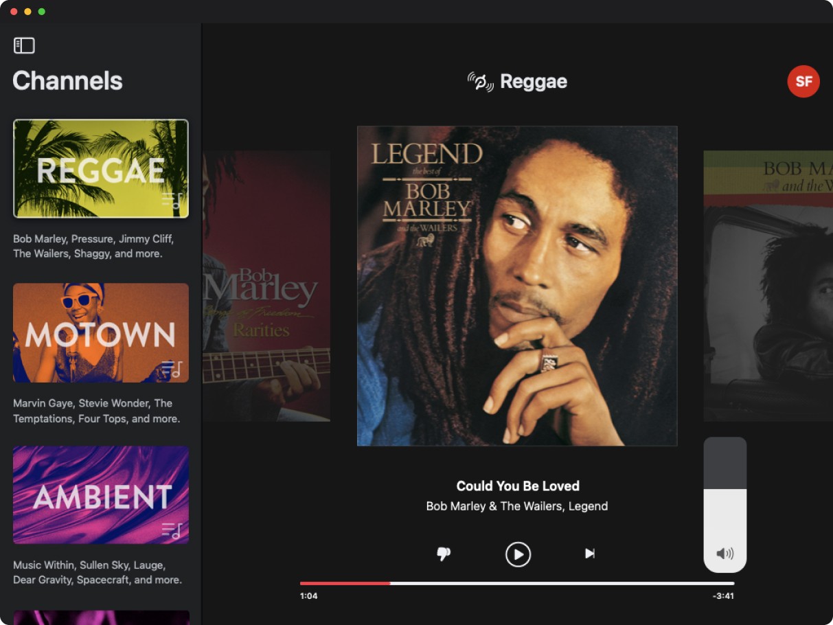
Peloton needed two different music tools. Retail staff needed an iPad app that could switch channels fast and moderate what played across the sales floor. Peloton's internal team needed something built for exploration, a way to browse and discover music on their own time. Same brand, different mental models.
I designed both in parallel. The retail app carried over Peloton's visual language from the Crescendo instructor app. It allowed staff to control music based on genre, mood, and time of day. I reimagined the HQ app with muted colors and a modern UI built for browsing, search, and personalization.

CHALLENGES
The retail player had 8 weeks from kickoff to handoff. The timeline shaped every decision, what to prioritize, what to cut, and how to get channel logic right fast. Channels weren't just playlists, they were curated by BPM and time of day. Getting that logic correct and tested meant locking decisions early and moving quickly.
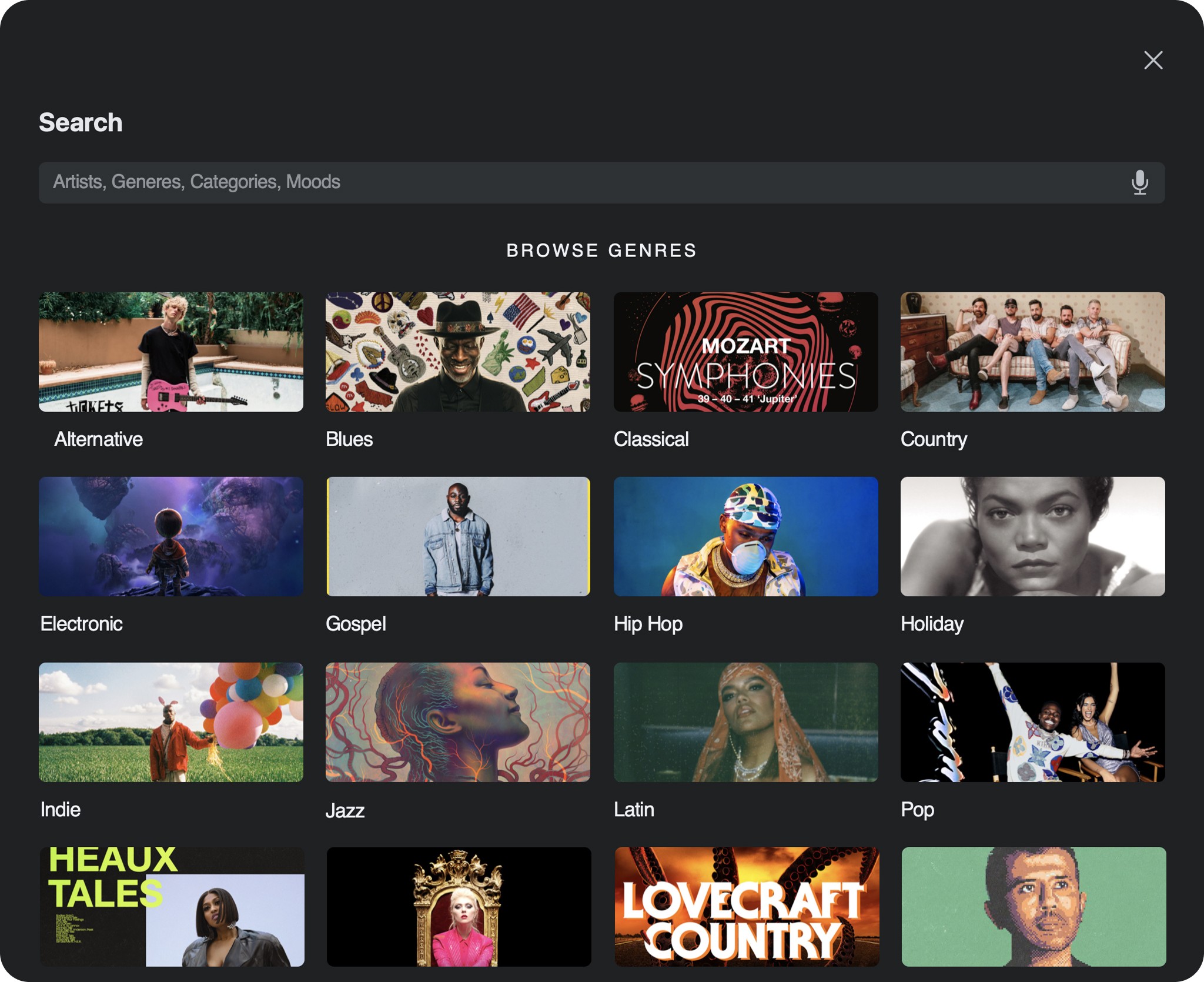
In just eight weeks, I designed, prototyped, tested, and secured leadership buy in for a complete mood based music experience. The final work introduced a new color system, mood cards, categories, and search, securing the executive approval needed for full development.




PROCESS
I ran moderated usability testing with Peloton store associates to understand how music fit into their actual workday. They needed something fast, minimal taps, nothing that pulled attention away from customers. I moved into wireframes early to validate core interactions before any visual design work, focusing on making channel switching and playlist selection fast and obvious. A second round of testing with associates drove the final refinements before handoff.
For the HQ app, I started with the color system, muting Peloton's existing palette and echoing the shape of the Peloton logo. I focused on hierarchy, deciding what a user should engage with first, second, and third, then introduced search so users could find music by genre, artist, category, or mood. I prototyped the MVP to give leadership a tangible case for developing and installing the app across Peloton's corporate locations.




BUSINESS IMPACT
The retail player didn't just launch, it became the standard. Every one of Peloton's showroom stores adopted it within two months of rollout, giving store staff control over the sales floor's energy in real time.
The HQ app was designed and developed to the same standard, but was tabled as Peloton shifted focus to newer initiatives with a more direct path to revenue, a business decision, not a reflection of the work itself.
DISCOVER MORE