Role Product Designer
Type Mobile UI Redesign
Platform iOS & Android
Domain Fintech / Digital Banking
Company ADP

Redesigning financial
tools people depend on
to get paid.

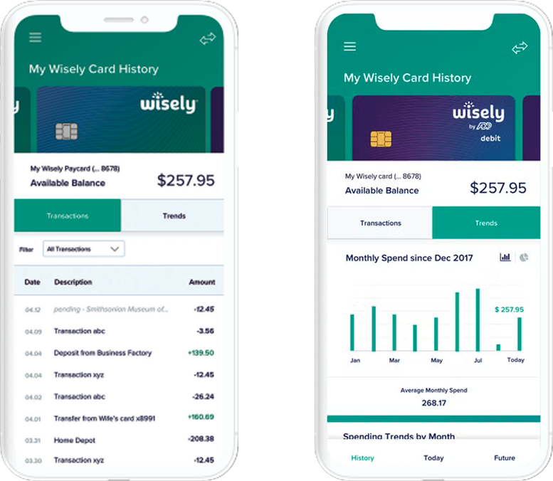
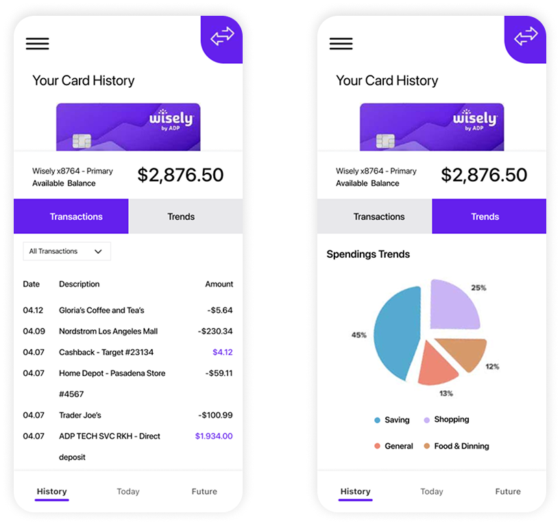
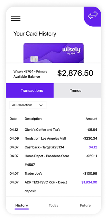
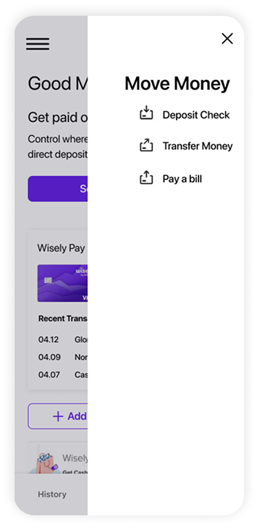
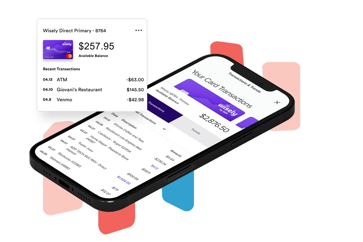
Wisely by ADP serves unbanked and underbanked workers — people for whom this app isn't a convenience, it's how they access their wages. When a rebrand required updating the transaction experience, the design challenge wasn't aesthetic: it was preserving the familiarity and trust users relied on while modernizing every surface to align with a new design system.

0
Core Flows Broken
iOS+
Android
ADP
Enterprise Scale
Wisely card trans

Trust is the product. Don't break it.

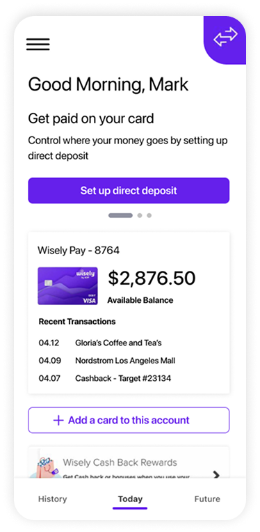
For Wisely users — gig workers, hourly employees, people without traditional bank accounts — this app is often their primary financial tool. They check it when they get paid. They use it at the register. They rely on it to know their balance before they spend.

A rebrand created the need to update the transaction experience across the app. The risk wasn't technical — it was behavioral. Any change that disrupted familiar patterns could erode the trust users had built with a product they depend on every payday.

The design challenge: modernize every surface to align with the new Wisely brand system without altering a single core workflow or creating confusion for existing users.

High-stakes user context Users are unbanked or underbanked — this is their primary financial tool, not a secondary app. Any confusion directly impacts financial access.
Rebrand-driven constraint The new design system dictated visual direction. Work required fitting within defined tokens while solving for user familiarity and trust.
Functional parity required No core functionality could be removed or moved. Users had muscle memory built around the existing flows — disruption wasn't an option.
Cross-platform delivery Updates needed to ship simultaneously on iOS and Android, requiring platform-specific adaptations within a single design pass.

Two audiences. One experience.

Primary User
Employees & Cardholders
Hourly workers, gig economy employees, and individuals without traditional bank accounts who receive wages via the Wisely card and manage their finances entirely through the app.
Clear, legible transaction history at a glance
Instant balance confidence before spending
Familiar flows that don't require relearning
Trust signals that reinforce financial security
Secondary User
Employers & Businesses
HR teams and payroll administrators at companies using Wisely for wage disbursement — particularly those without traditional direct deposit infrastructure.
Reliable disbursement that employees can trust
Reduced support burden from employee confusion
Seamless integration with existing payroll systems
Scalable across large hourly workforces

Systematic, not arbitrary.

01
Audit & Inventory
Mapped every screen in the transaction experience — states, edge cases, error flows, empty states — before touching a single design. No surprises in delivery.
Research
02
System Alignment
Analyzed the new Wisely brand system — color tokens, typography scale, spacing, component patterns — to understand what was prescribed versus what remained a design decision.
Systems
03
High-Fidelity Redesign
Redesigned the full transaction flow screen by screen — transaction list, detail views, confirmation states, and error handling — within the new brand framework.
Design
04
Validation & Handoff
Validated updates against existing user flows and patterns. Delivered annotated specs for iOS and Android, flagging platform-specific adaptations and edge case handling.
Delivery

The tradeoffs that shaped the work.

01
Preserve layout, update skin
Rather than rethinking the IA, I made a deliberate choice to keep all navigational and structural patterns identical to the existing app. Users shouldn't have to relearn anything — only perceive a visual refresh.
Tension: New brand system wanted bolder visual departures. Advocated for a more conservative approach to protect user trust.
02
Legibility over aesthetics in transaction lists
Transaction history is scanned quickly under pressure — at the register, on the bus, mid-purchase. Typography size, contrast ratios, and information hierarchy were optimized for speed-reading, even where it meant pulling back on visual flair.
Tension: Brand guidelines pushed smaller, tighter type. Pushed back with accessibility and real-world usage data.
03
Trust signals in every confirmation state
For users dependent on this app for wages, uncertainty about a transaction's status is more stressful than for typical banking users. Designed explicit, unambiguous confirmation and error states — no ambiguous "processing" spinners without context.
Tension: Engineering preferred simpler generic states. Worked through examples showing where vagueness would create support tickets.

Before & after.

Before — Legacy Transaction View
Redesigned Wisely transaction screen
After — Redesigned Transaction View
Legacy Wisely transaction screen
Balance view
Screen 01
Balance Overview
Primary home state — current balance, quick actions, and recent transaction preview.
Transaction list
Screen 02
Transaction List
Chronological transaction history — merchant name, amount, category, and status at a glance.
Transaction detail
Screen 03
Transaction Detail
Full transaction breakdown — merchant, amount, date, status, and dispute option where applicable.

A rebrand that didn't break trust.

0
Core Flows Disrupted
Every existing user workflow was preserved with full functional parity across the updated experience.
100%
Brand System Compliance
All screens updated to align with Wisely's new design system — tokens, typography, and component patterns.
iOS+
Android Parity
Simultaneous platform delivery with platform-appropriate adaptations for each OS convention.
User Confidence
Explicit confirmation and error states reduced ambiguity for users in high-stakes financial moments.
Next Project
Peloton — Music Player