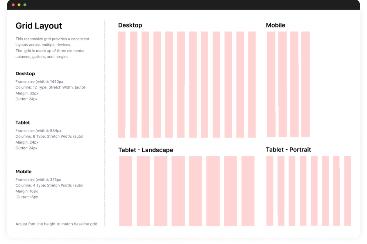
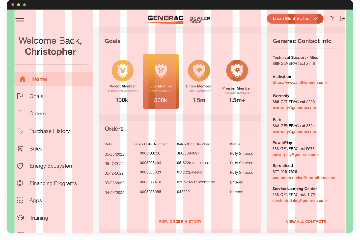
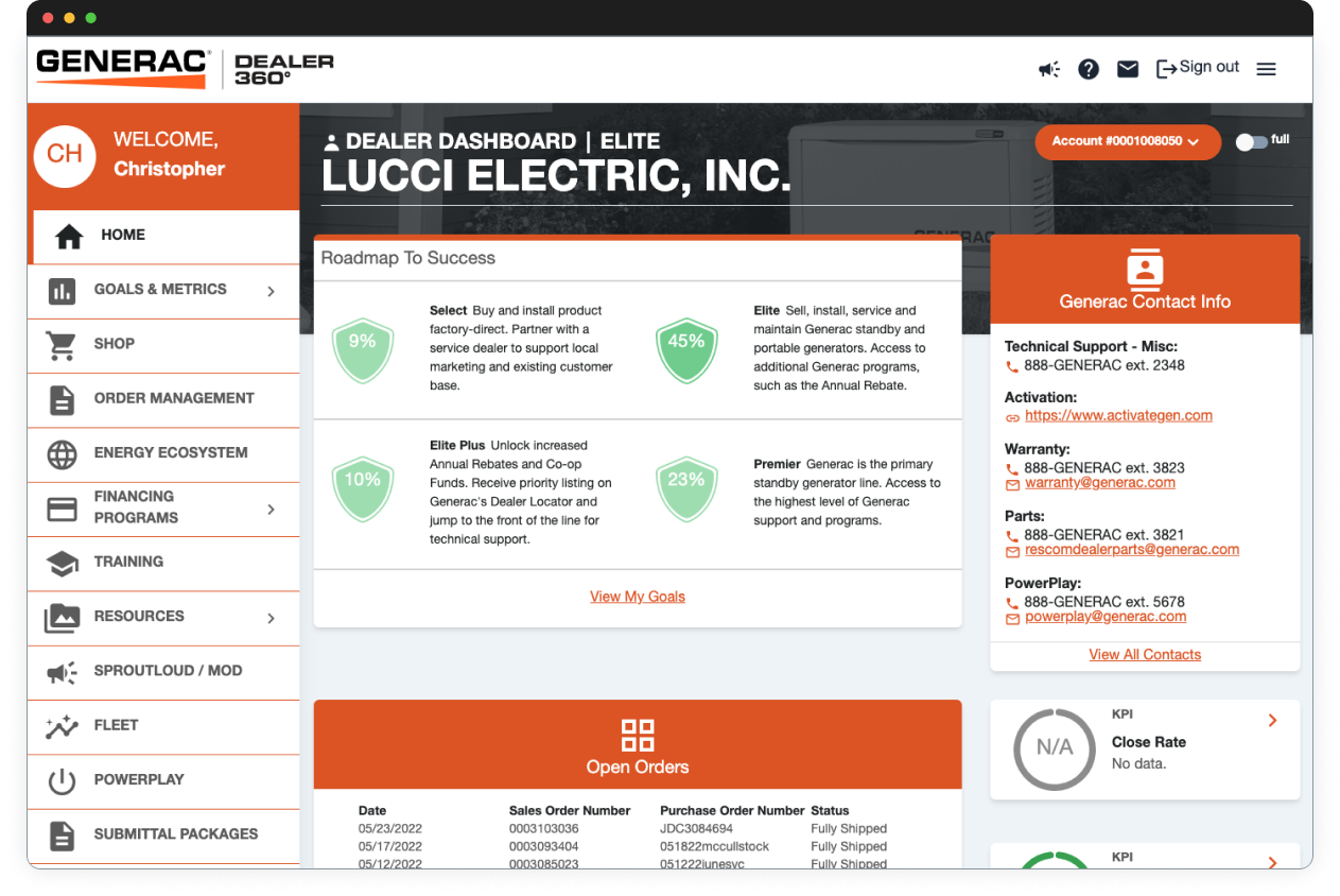
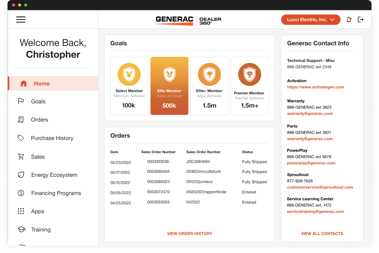
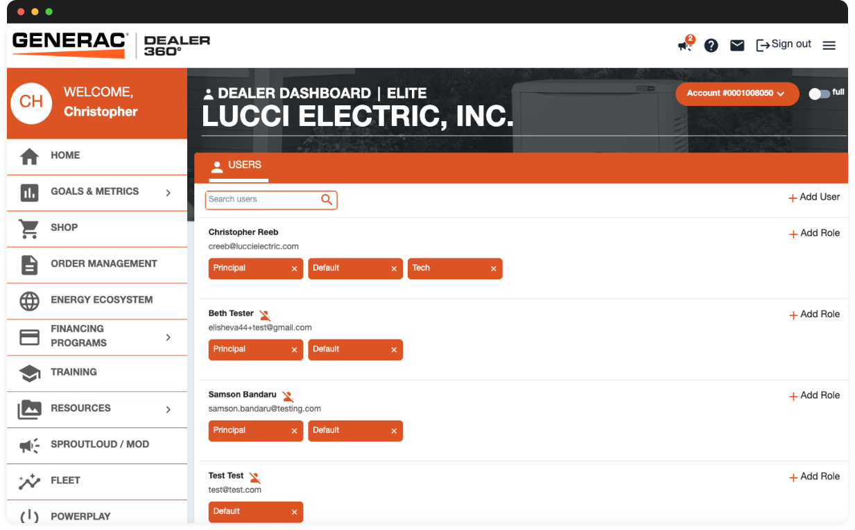
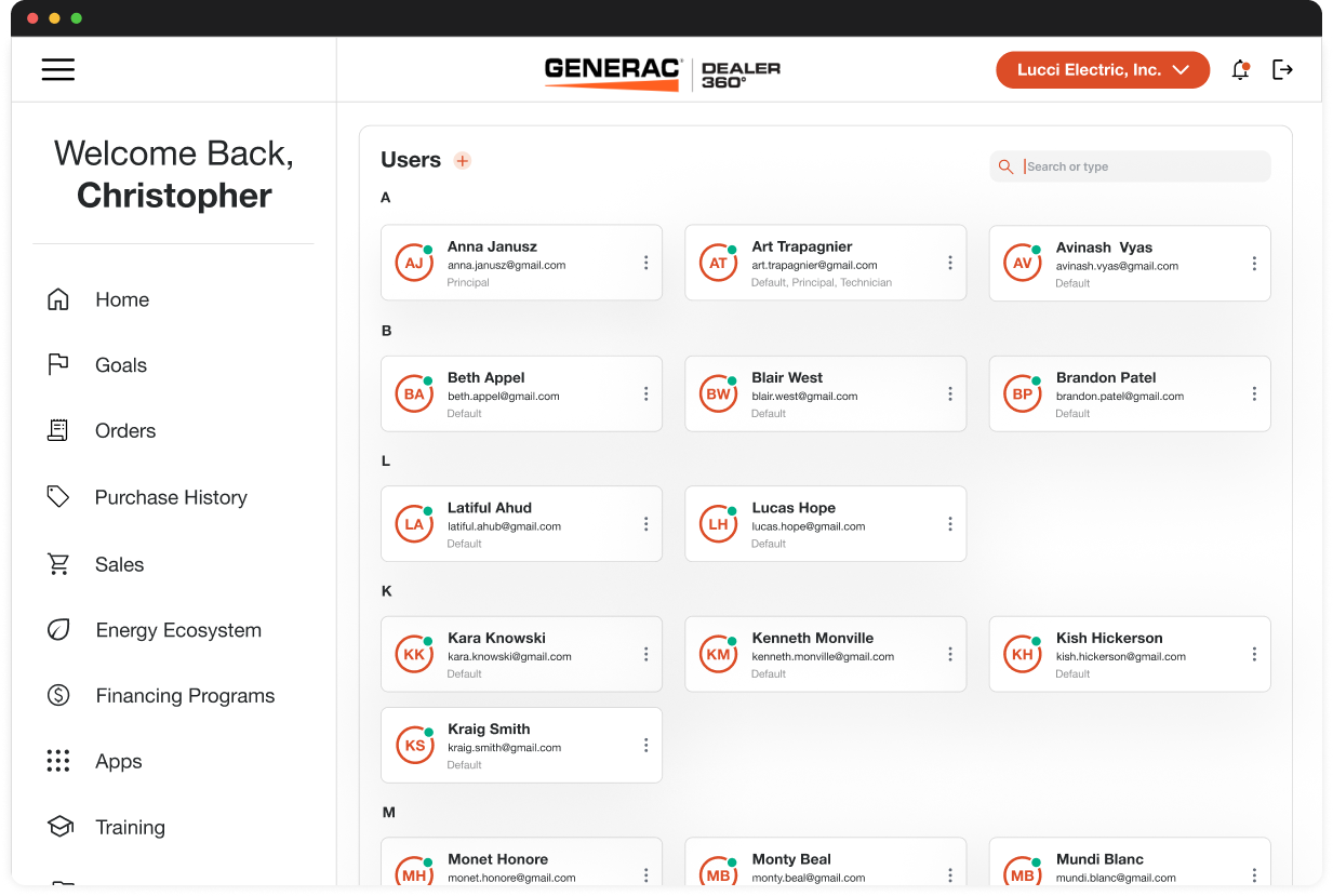
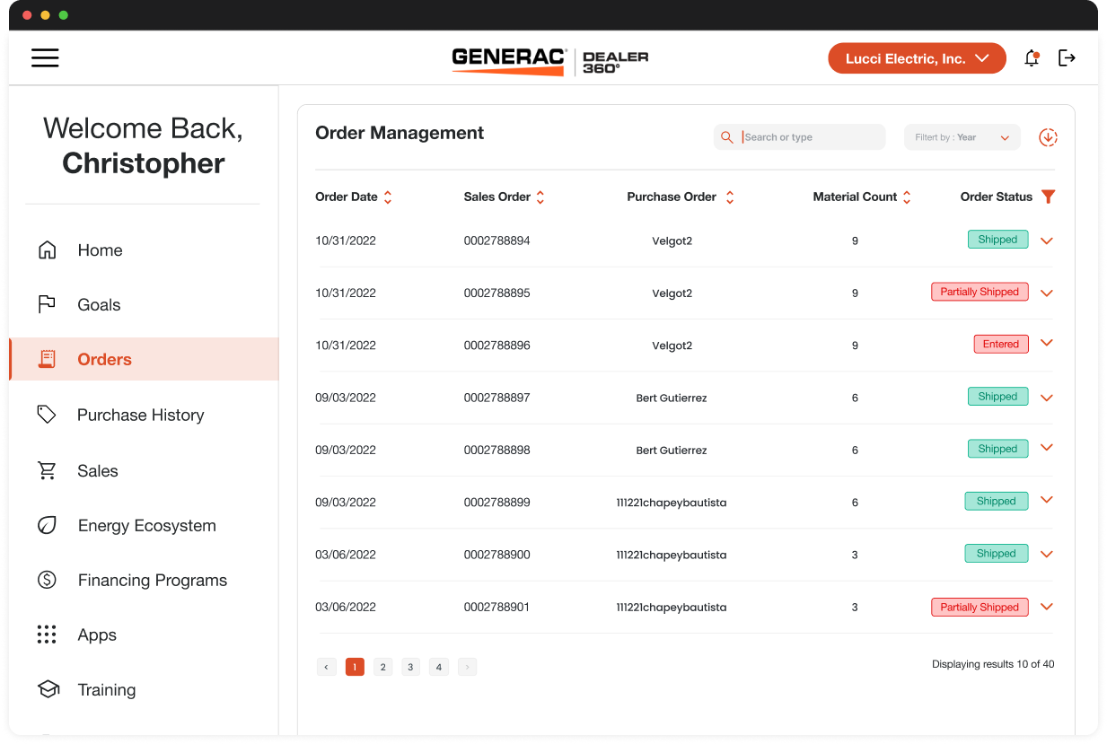
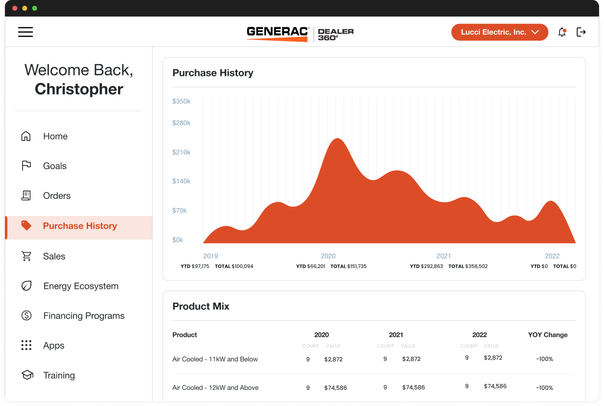
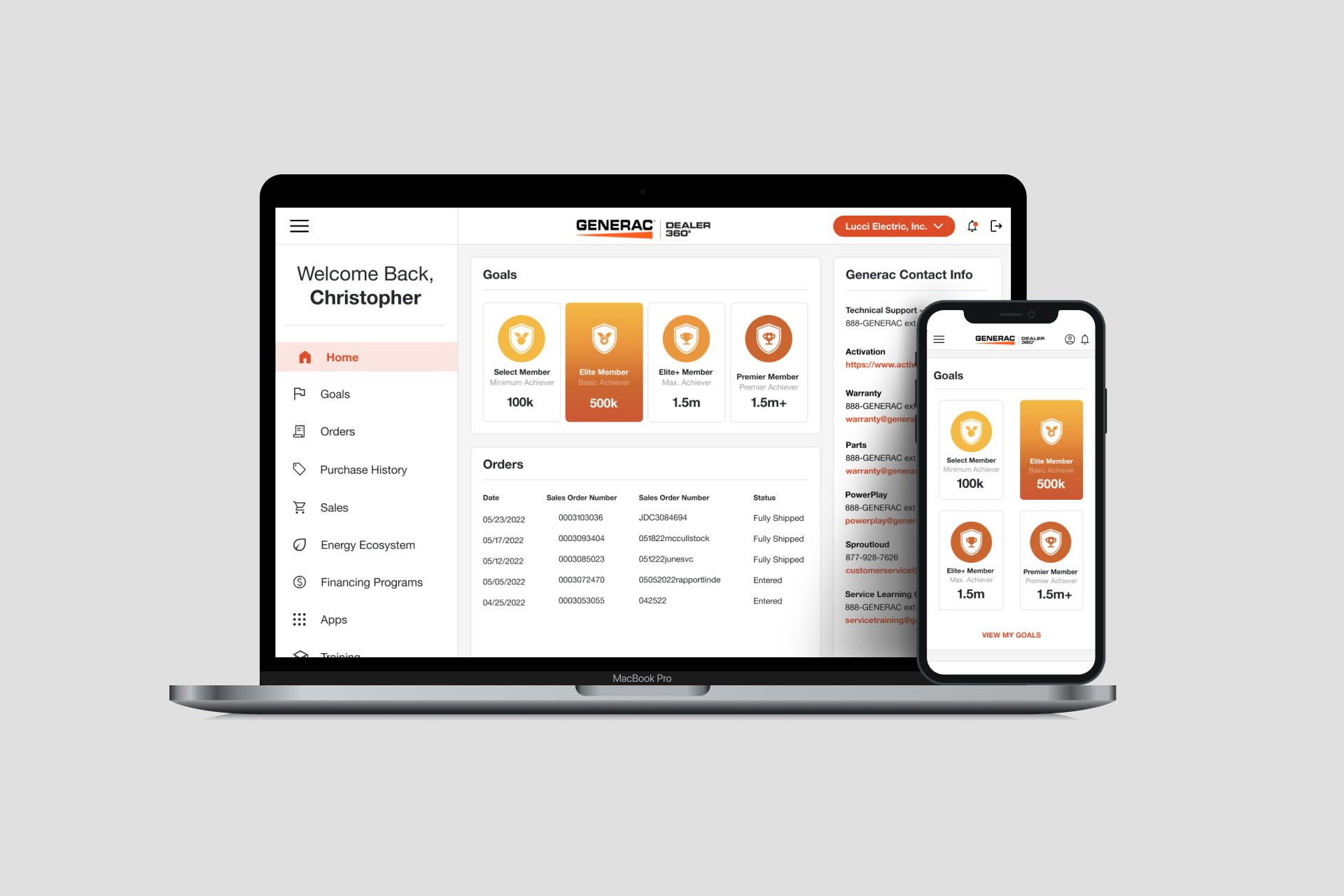
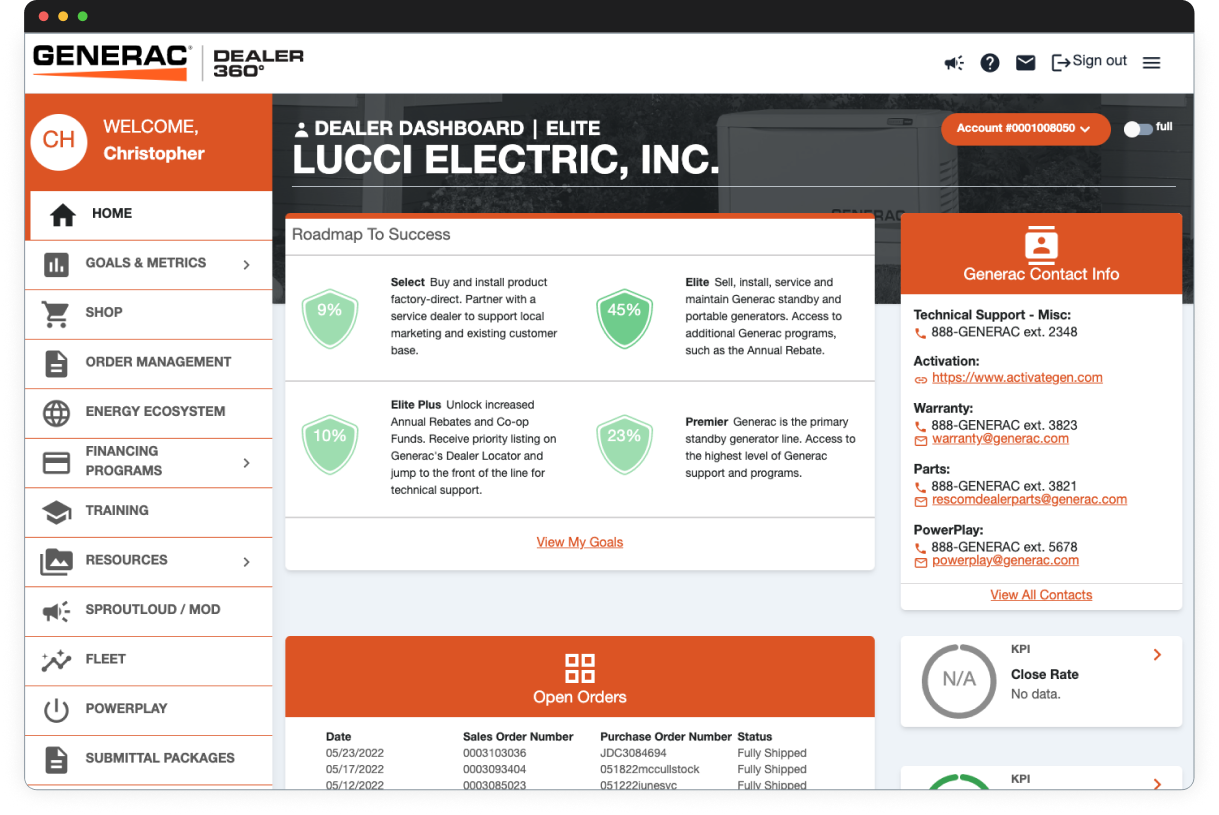
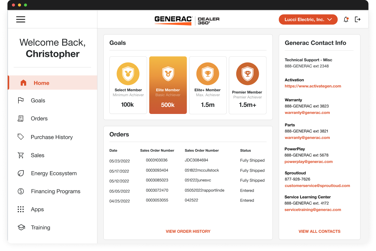
Generac's Dealer 360 platform was losing users to friction, unclear workflows, and a UI that hadn't kept pace with the business. I led a full UI modernization — rebuilding the information architecture, shipping a scalable design system, and redesigning key flows to reduce drop-off and drive adoption across a tiered dealer network.
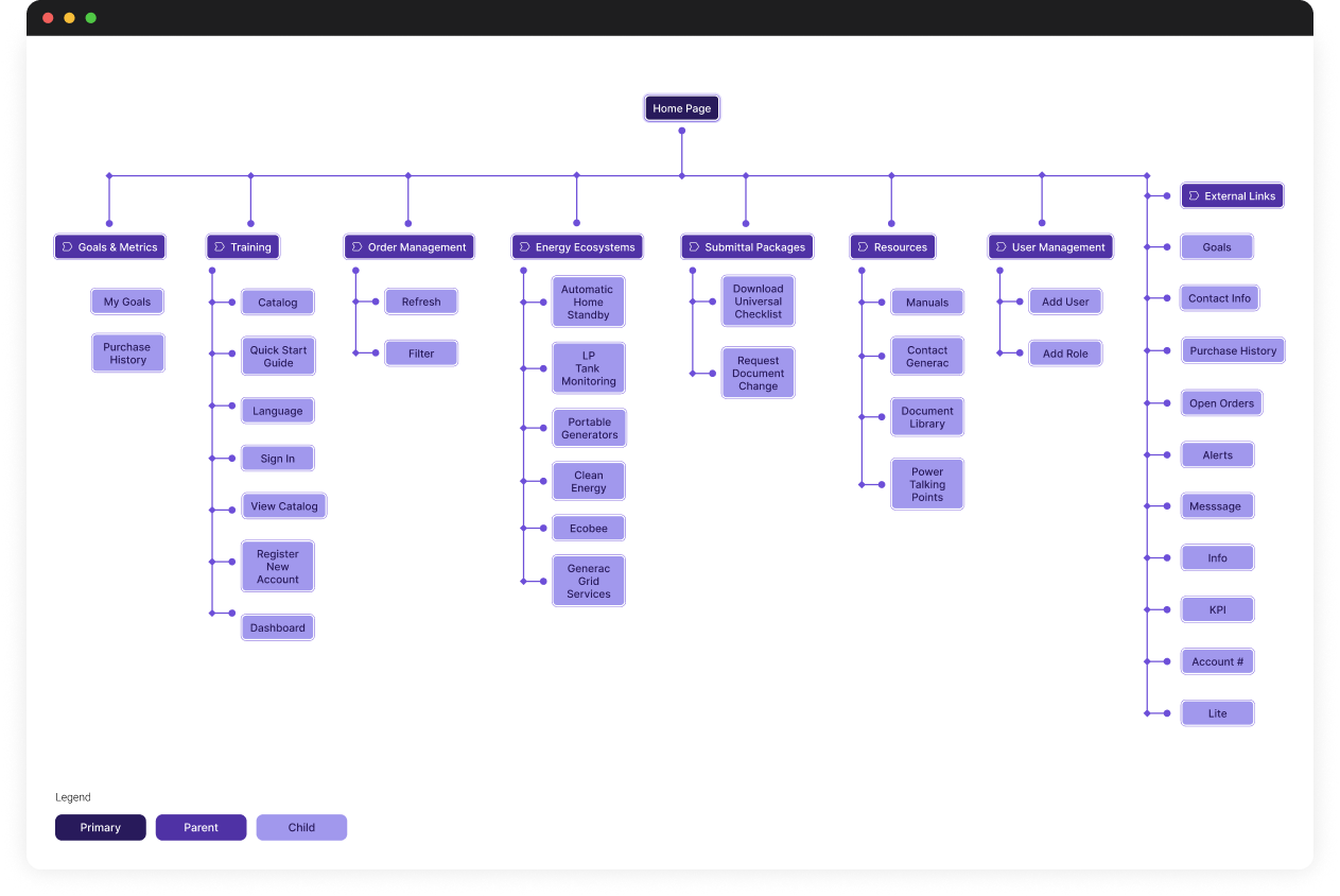
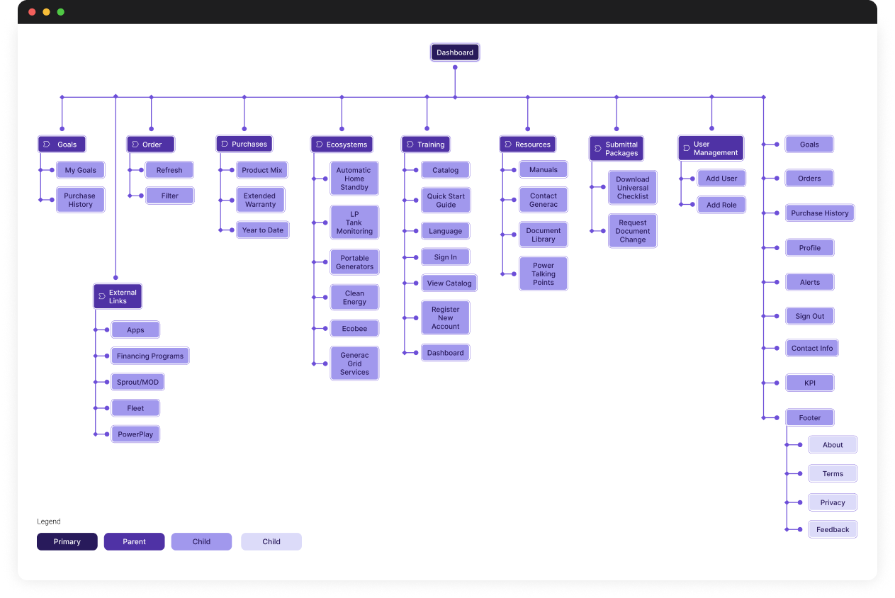
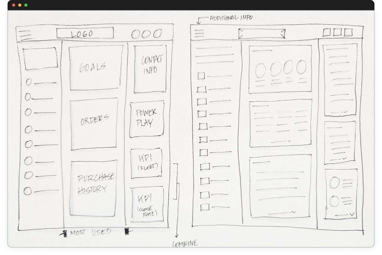
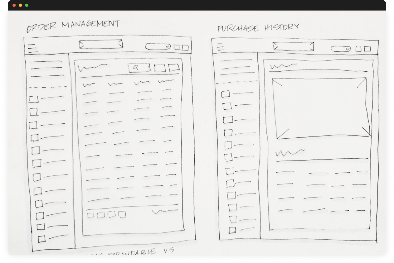
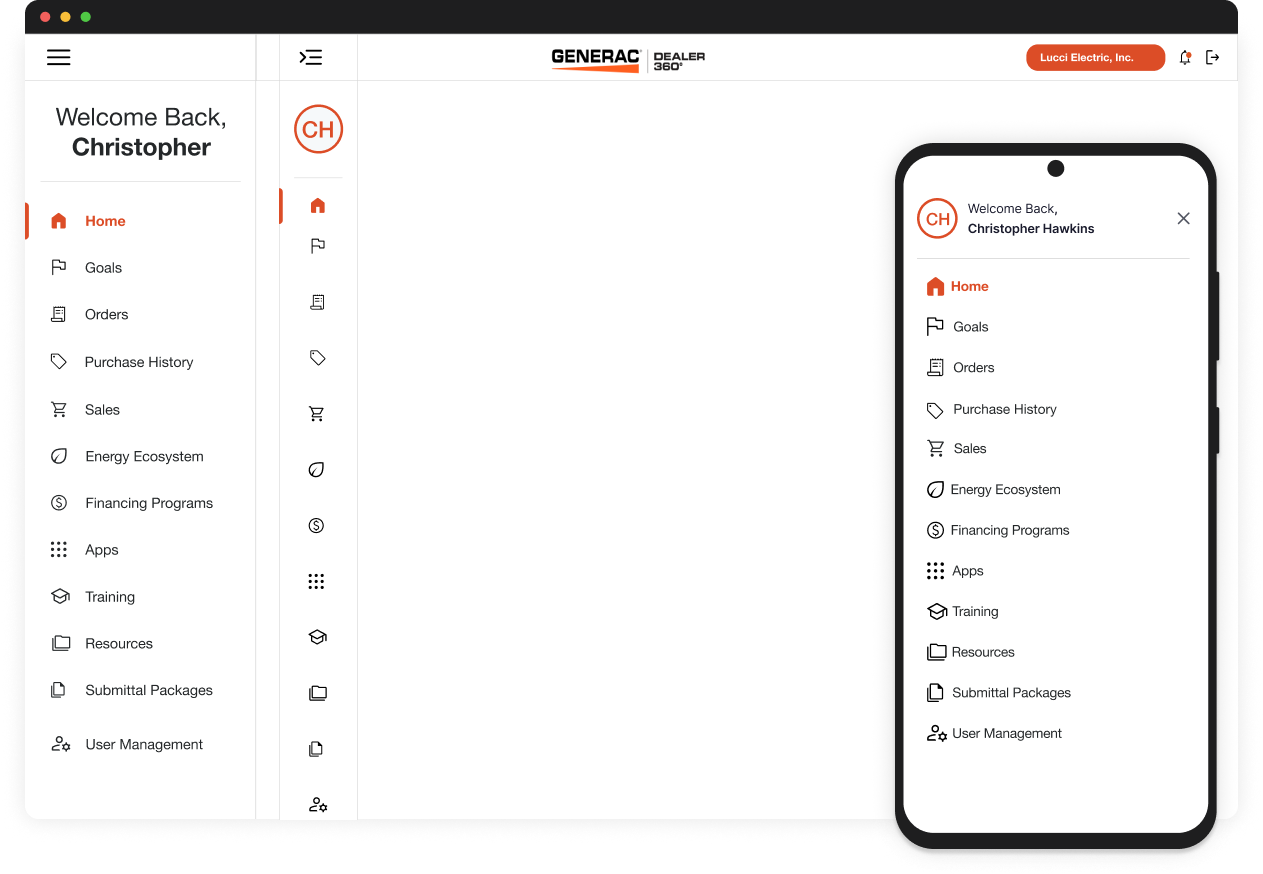
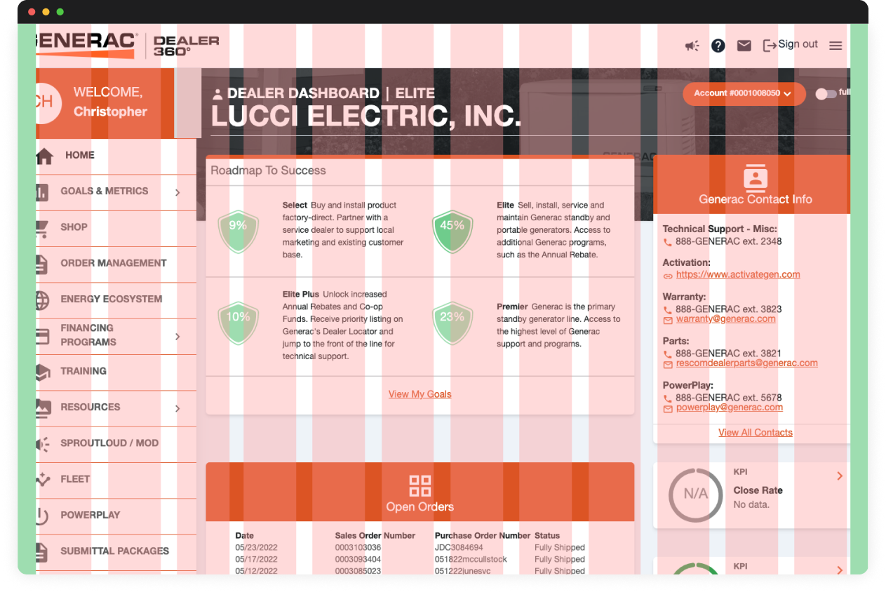
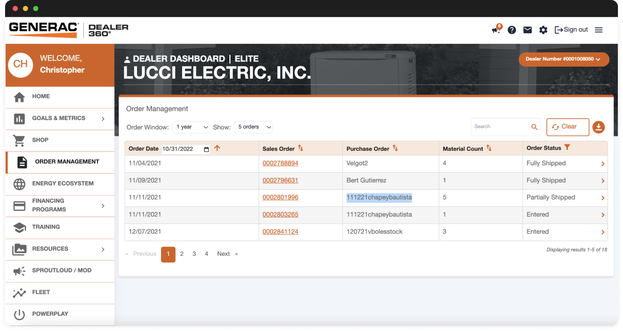
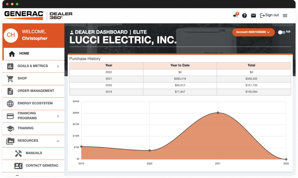
Generac Dealer 360 had grown organically over time — features were added without a coherent system, the IA reflected internal org structure rather than dealer workflows, and the visual language was inconsistent across modules.
The result: dealers were abandoning key tasks mid-flow, support tickets were climbing, and adoption of high-value features (rebate programs, co-op funds) was far below potential.